The avatar component is designed to showcase either an image, a label, or a default SVG placeholder. It's a versatile tool that allows you to create various features, such as profile pictures, with ease. The alert component natively has 6 colors, which are: primary, secondary, positive, negative, warning and info.
A remarkably straightforward method for utilizing the avatar is by simply providing a link to the desired photo you wish to display.


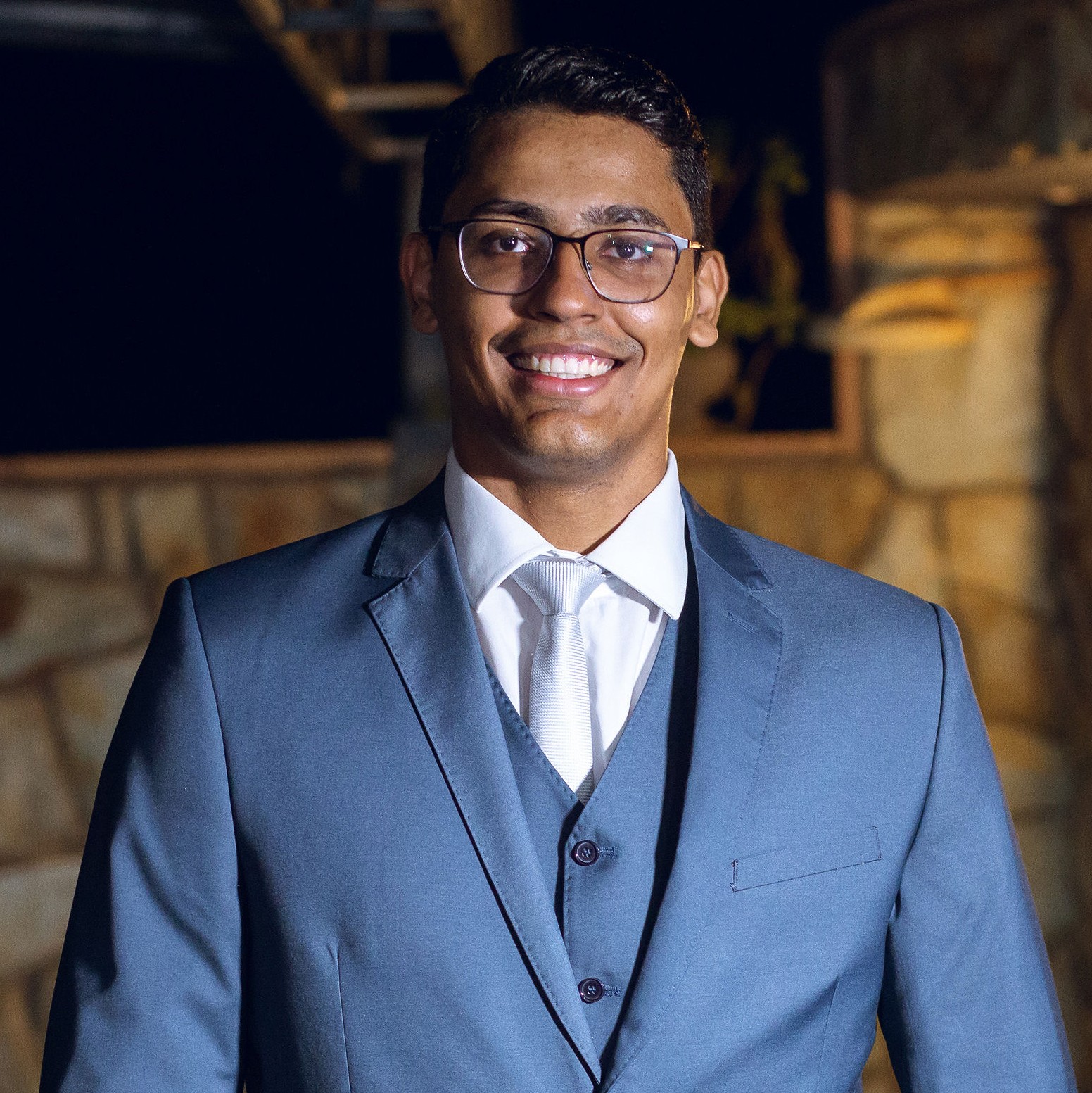

1<x-avatar xs warning :src="Vite::docs('andre.jpeg')" />2 3<x-avatar sm primary :src="Vite::docs('fernando.jpeg')" />4 5<x-avatar md :src="Vite::docs('keithyellen.jpg')" />6 7<x-avatar lg :src="Vite::docs('joao-pedro.jpg')" />8 9<x-avatar xl :src="Vite::docs('pedro.jpg')" />An alternative approach for using the avatar involves providing the label attribute, typically containing initials or a state representation.
1<x-avatar xs label="AB" /> 2 3<x-avatar sm label="AB" /> 4 5<x-avatar md label="AB" /> 6 7<x-avatar lg label="AB" /> 8 9<x-avatar xl label="AB" />10 11<x-avatar 2xl>12 <x-slot name="label" class="!text-rose-300 !font-extrabold italic">13 AB14 </x-slot>15</x-avatar>The avatar now offers rounded customization options, giving you the flexibility to utilize either Tailwind's default settings or apply your own custom values.
1{{-- CSS: 'rounded-none' - You can use |rounded="none"| too --}} 2<x-avatar xl squared :src="Vite::docs('pedro.jpg')" /> 3 4{{-- CSS: 'rounded-sm' --}} 5<x-avatar xl rounded="sm" :src="Vite::docs('joao-pedro.jpg')" /> 6 7{{-- CSS: 'rounded-sm' --}} 8<x-avatar xl rounded="base" :src="Vite::docs('andre.jpeg')" /> 9 10{{-- CSS: rounded --}}11<x-avatar xl rounded="md" :src="Vite::docs('fernando.jpeg')" />12 13{{-- CSS: 'rounded-lg' --}}14<x-avatar xl rounded="lg" :src="Vite::docs('keithyellen.jpg')" />15 16{{-- CSS: 'rounded-xl' --}}17<x-avatar xl rounded="xl" :src="Vite::docs('pedro.jpg')" />18 19{{-- CSS: 'rounded-2xl' --}}20<x-avatar xl rounded="2xl" :src="Vite::docs('joao-pedro.jpg')" />21 22{{-- CSS: 'rounded-3xl' --}}23<x-avatar xl rounded="3xl" :src="Vite::docs('andre.jpeg')" />24 25{{-- CSS: 'rounded-full' - You can use |rounded| too - DEFAULT --}}26<x-avatar xl rounded="full" :src="Vite::docs('fernando.jpeg')" />27 28{{-- Or Custom --}}29<x-avatar xl rounded="rounded-[1.25rem]" :src="Vite::docs('keithyellen.jpg')" />The size property offers a broad spectrum of options, coupled with the flexibility for customization to suit your specific needs.
1{{-- CSS: 'w-6 h-6' --}} 2<x-avatar 2xs :src="Vite::docs('keithyellen.jpg')" primary /> 3 4{{-- CSS: 'w-7 h-7' --}} 5<x-avatar xs label="AB" info /> 6 7{{-- CSS: 'w-8 h-8' --}} 8<x-avatar sm label="AB" negative /> 9 10{{-- CSS: 'w-10 h-10' - DEFAULT --}}11<x-avatar md label="AB" warning />12 13{{-- CSS: 'w-12 h-12' --}}14<x-avatar lg :src="Vite::docs('joao-pedro.jpg')" positive />15 16{{-- CSS: 'w-14 h-14' --}}17<x-avatar xl label="AB" secondary />18 19{{-- CSS: 'w-16 h-16' --}}20<x-avatar 2xl label="AB" primary />21 22{{-- Or Custom --}}23<x-avatar size="w-20 h-20" :src="Vite::docs('pedro.jpg')" primary />You now have the option to adjust the icon's size to your liking. Please keep in mind that the default icon size aligns with the component's size, but you have the freedom to customize it as desired. It's important to clarify that this size modification exclusively pertains to the label and SVG icons.
1{{-- CSS: [ 'icon': 'w-4 h-4', 'label': 'text-2xs' ] --}} 2<x-avatar 2xl icon-size="2xs" icon="x-mark" primary /> 3 4{{-- CSS: [ 'icon': 'w-5 h-5', 'label': 'text-xs' ] --}} 5<x-avatar 2xl icon-size="xs" label="AB" info /> 6 7{{-- CSS: [ 'icon': 'w-7 h-7', 'label': 'text-sm' ] --}} 8<x-avatar 2xl icon-size="sm" label="AB" negative /> 9 10{{-- CSS: [ 'icon': 'w-8 h-8', 'label': 'text-base' ] --}}11<x-avatar 2xl icon-size="md" label="AB" warning />12 13{{-- CSS: [ 'icon': 'w-9 h-9', 'label': 'text-lg' ] --}}14<x-avatar 2xl icon-size="lg" icon="x-mark" positive />15 16{{-- CSS: [ 'icon': 'w-12 h-12', 'label': 'text-xl' ] --}}17<x-avatar 2xl icon-size="xl" label="AB" secondary />18 19{{-- CSS: [ 'icon': 'w-16 h-16', 'label': 'text-2xl' ] --}}20<x-avatar 2xl icon-size="2xl" label="AB" primary />You also have the ability to customize the border thickness of the avatar. You can stick with the default values or tailor it to your preferences in any way you see fit.
1{{-- CSS: border-0 - You can use |borderless| too --}} 2<x-avatar sm label="AB" negative border="none" /> 3 4{{-- CSS: border --}} 5<x-avatar md label="AB" warning border="thin" /> 6 7{{-- CSS: border-2 - DEFAULT --}} 8<x-avatar lg label="AB" positive border="base" /> 9 10{{-- CSS: border-4 --}}11<x-avatar xl label="AB" primary border="thick" />12 13{{-- Or Custom --}}14<x-avatar 2xl label="AB" primary border="border-8" />When neither text nor an image is provided, the avatar will present a default SVG placeholder. You have the option to select your preferred icon for rendering, or it will default to a user icon.
1<x-avatar 2xs icon="academic-cap" /> 2 3<x-avatar xs info icon="arrow-down" /> 4 5<x-avatar sm negative icon="chat-bubble-left-ellipsis" /> 6 7<x-avatar md warning icon="building-office-2" /> 8 9<x-avatar lg positive icon="bell-slash" />10 11<x-avatar xl primary icon="at-symbol" />12 13<x-avatar 2xl icon="arrow-up-circle" />Here's an example of how you can utilize the avatar component to create a group.
1<div class="flex items-center -space-x-2"> 2 <x-avatar :src="Vite::docs('fernando.jpeg')" /> 3 4 <x-avatar :src="Vite::docs('andre.jpeg')" /> 5 6 <x-avatar :src="Vite::docs('keithyellen.jpg')" /> 7 8 <x-avatar :src="Vite::docs('joao-pedro.jpg')" /> 9 10 <x-avatar :src="Vite::docs('pedro.jpg')" />11</div>